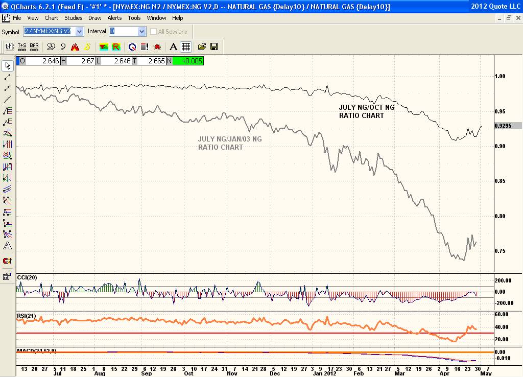
Here is what I'm referring to regarding Ratio charts. Take the highest open interest nearby contract which is July and compare it to a high open interest back month like October (Nov was not the more active month that I mentioned earlier as Oct is more active) Dec is not active at all either.
Ok that is the top line chart.
The lower chart is again the high open interest contract being July compared to the most active back month being Jan/03. So comparing these this way you can see how the nearby contracts are doing 'relative' to the back months. As I said I'm no expert in these strategies and the exact meaning of them. All I do know is ratio charts which are very telling. And normal markets have contango including bear markets especially. Bullish months show backwardation which means the front month is stronger and more expensive than the back months. So to be bullish one would want to see these line charts rise. But best to talk to someone who is an expert in strategies and run this by him/her to get a better insight as to how to actually trade this or at least how to plan a trade that shows this.