A picture is definitely "worth 1,000 words" as the old saying goes, and in the case of a price chart, a picture is also a reflection of the underlying cumulative fundamentals. Once the directional tone is set you can be assured it has the backing of current economics, whether we see those economics or not. While the cause of market movement is nearly always debatable, price movement itself is not. The pattern is either bullish of bearish - there is no in-between. This is why we find Risk Tolerance Threshold Theory to be so useful in analyzing market movement.
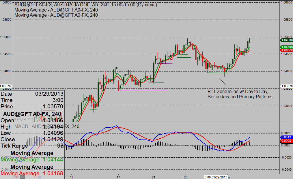
Figure 1.
In Chapter 4 of The Secret to Trading Forex, Futures, and ETFs: Risk Tolerance Threshold Theory, under Tenet 6 it reads: "when price cannot close beyond an individual RTT level the direction of the pattern…for that time frame is maintained". That simple statement is incredible helpful to traders, as the charts in Figure 1 and 2 attest. In Figure 1 the 10-day pattern on the 4-hour chart cannot reverse lower until it closes beyond that green support line (10-day RTT level). It's an absolute condition. As long as price is closing above that level the pattern remains bullish.
(click to enlarge)
Figure 2.
Likewise when we look to the lower time frame 15-minute chart in Figure 2 we see the same dynamic playing out 2 days later on a lower time frame. As long as price is holding above the 24-hour RTT Zone (the band of support created by the purple and green lines) that time frame pattern is bullish. When the pattern is bullish and aligned with the majority of patterns, as was this case, we focus on buy set-ups and signals with a specified risk/reward. We also know to put emphasis on simple candle stick formations, such as a double-bottom, in that support zone.
By breaking down a market and identifying its individual patterns to come up with one collective pattern we are allowing the market to guide us rather than relying on linear analysis. In other words we are applying higher time frame confirmation which is also categorized as "fractal analysis" or nonlinear techniques. What is the advantage of this?
To quote Doctor Bill Williams, author of Trading Chaos "In this early part of the twenty-first century, we have a choice to either be a part of the last generation of traders and investors using linear (ineffective) techniques, or the first generation using effective nonlinear (chaotic) techniques".
I think that says it all.
As for the future direction of the Australian Dollar, just watch to see if that last impulse up-move retraces beyond its RTT zone. If not, repeat the process that played out in Figure 2.
Jay Norris is the author of The Secret to Trading: Risk Tolerance Threshold Theory. To see Jay highlight trade set-ups and signals in live markets go to Live Market Analysis
Trading involves risk of loss and is not suitable for all investors.