Made up a new word, I think, Linear(line) izing(making), in this case making something non-linear, linear. Probably a bad choice of a word but, hey. What you going to do. In other words I'm going to put the round Gann wheel onto the chart...for price, in this example.
How? Imagine...placing the zero degree mark on the Gann wheel at zero on the price scale then rolling the wheel up the price bar on the right of the chart...or left if you're a democrat. haha Told you, everything is politics. Imagine as you roll the wheel up the price bar the wheel puts a line on the chart at every thirty(30) degree point. 30,60,90,120 etc. 30,60,90,120 of course, being the circle of 360 degrees divided by 12.
You could, if you wanted, have the wheel put a mark at every single degree as you roll the wheel up the price bar. This accomplishes nothing as there are no demarcation points of any significance...assuming there are any significant points at all. Gann would suggest 30,60,90, are more important. Why? I think it has to do with something like this...everyday seems to blend in with each other day...just ticking along...day, day, day with no significant demarcation. So somebody got to noticing...hey, if we put a mark on the calendar every 7 days we can represent 52 weeks in the year. Then someone said, hey...they literally did say that, hey...lets put an even bigger demarcation point that signifies the year cut up into 12 pieces and call it a month.
This is how that would look on a chart where the wheel marks off every 15 degrees. Yes the price bar on the right shows that it's marked off every 150 dollars but price is arbitrary and matters not especially since we are not dealing with mass. Notice the 30, 60, 90 are the more major divisions with the 15 degree points being half way or 50% of the major.
Although price appears to meander among these geometrical divisions of the circle they sometimes stop dead on, sometimes they go past them, sometimes not attaining the next greater division. Each approach, passing through, passing through and then back through has a story to tell. The story it tell is about energy in the market. Does it have the buy energy to maintain a level above the last level broken or not. Does it have the buying energy to move to the 50% of the next greater level?
Exactly the same as electrons in an atom...is there energy enough to put an electron into the next higher shell level and hold it there or has energy been removed and the electron drops out of the high shell and the electron drops to an at rest shell.
AS you get into smaller time frame charts you will likely want to add further divisions so as to find a more relevant level closer to current price. Like every 7.5 degrees(half of 15) or even 3.75 degrees(half of 7.5).
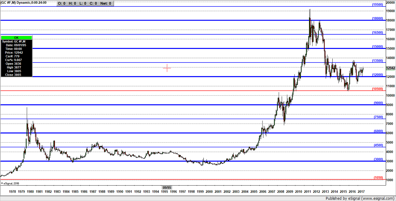
But anyway...monthly gold.